
Ever opened a website and within a few seconds immediately knew what's being offered, why it's appealing, and which button to click?
That's the power of a well-designed landing page.
On the other hand, even a landing page that looks modern can fail to generate leads or sales when visitors have to think too long to understand the offer.
That's why looking for landing page examples before you start designing isn't just about finding a pretty look to copy. A good reference helps you understand how a page structures its headline, visuals, social proof, product benefits, all the way to the call-to-action so visitors move toward one clear goal.
Interestingly, Unbounce data analyzing more than 41,000 landing pages, 464 million visits, and 57 million conversions found the median conversion rate across industries sits around 6.6%. The same data also shows around 83% of landing page visits happen on mobile devices.
In other words, an appealing landing page example isn't just one that looks good on desktop, but one that can deliver its message quickly and still feel comfortable to use on a smartphone screen.
In this guide, you'll see more than 10 types of landing page inspiration for various business needs, complete with structure, why the design is effective, and how to adapt it for your own website.
Table of Contents
- What Is a Landing Page?
- 12 Compelling Landing Page Examples by Business Type
- 1. SaaS or Digital Product Landing Page
- Design inspiration
- Best suited for
- 2. Mobile App Landing Page
- 3. Fashion and Retail Landing Page Examples
- Key elements
- 4. F&B Landing Page Example
- An effective structure
- 5. Real Estate Landing Page Example
- Real estate landing page structure
- 6. Webinar or Event Landing Page
- Hero
- Then
- 7. Professional Services Landing Page
- 8. SME Landing Page
- 9. Single-Product E-commerce Landing Page
- Problem
- Product
- Benefit
- Proof
- Offer
- CTA
- 10. Lead Generation Landing Page
- 11. Personal Brand or Portfolio Landing Page
- 12. Campaign or Seasonal Promo Landing Page
- Landing Page Structure Comparison by Industry
- 7 Elements Always Found in Good Landing Page Examples
- 1. A Headline That Immediately Explains the Value
- 2. A Subheadline That Complements the Headline
- 3. Visuals That Explain the Product
- 4. A Specific CTA
- 5. Social Proof
- 6. Mobile-First Design
- 7. One Clear Conversion Goal
- Anatomy of a Simple Landing Page You Can Copy
- Hero
- Problem
- Solution
- Benefit
- Social Proof
- How It Works
- FAQ
- Final CTA
- Example Landing Page Wireframe
- How to Choose the Right Landing Page Inspiration
- 1. Is the target audience similar?
- 2. Is the conversion goal the same?
- 3. Is the user's awareness level the same?
- 4. Does the product require a high level of trust?
- 5. Does the design still work well on mobile?
- Don't Copy a Landing Page Raw
- A Pretty Landing Page Doesn't Necessarily Convert
- How Does a Landing Page Support SEO?
- How to Make a Landing Page More SEO and AI Search Friendly?
- Use direct answers
- Create a logical heading structure
- Use entities and related terms
- Add experience and concrete examples
- Include trustworthy sources
- Build a topic cluster
- Checklist for an Appealing Landing Page
- Frequently Asked Questions About Landing Page Examples
- What is a landing page?
- What's a good landing page example?
- What does a landing page contain?
- What's the difference between a landing page and a website?
- Does a landing page need to have a lot of content?
- What's a simple landing page example for a small business?
- Where can I find landing page inspiration?
- Is it okay to copy a competitor's landing page?
- Does a landing page need to be mobile-friendly?
- What's a good landing page conversion rate?
- Conclusion
What Is a Landing Page?
A landing page is a web page built to drive visitors toward one main action, such as buying a product, filling out a form, making a reservation, registering for a webinar, trying an app, or contacting the business.
Unlike a homepage, which usually has many navigation paths, a landing page tends to lead visitors toward a single conversion goal.
For example:
- clicking a WhatsApp button;
- filling out a consultation form;
- buying a product;
- registering an account;
- trying software;
- downloading an e-book;
- making a reservation;
- requesting a quotation;
- registering for an event.
That's why a landing page's structure is usually more focused than a regular website page.
In short: a homepage helps visitors explore your business, while a landing page helps visitors take one specific action.
If you're still at the early stage of building a site, you can also read our guide on how to build a website to understand website structure more thoroughly before creating a dedicated campaign page.
12 Compelling Landing Page Examples by Business Type
There's no single landing page design that fits every business. A SaaS product landing page naturally needs a different approach than a restaurant, real estate, or professional service.
Here are some landing page design examples you can use as a reference.
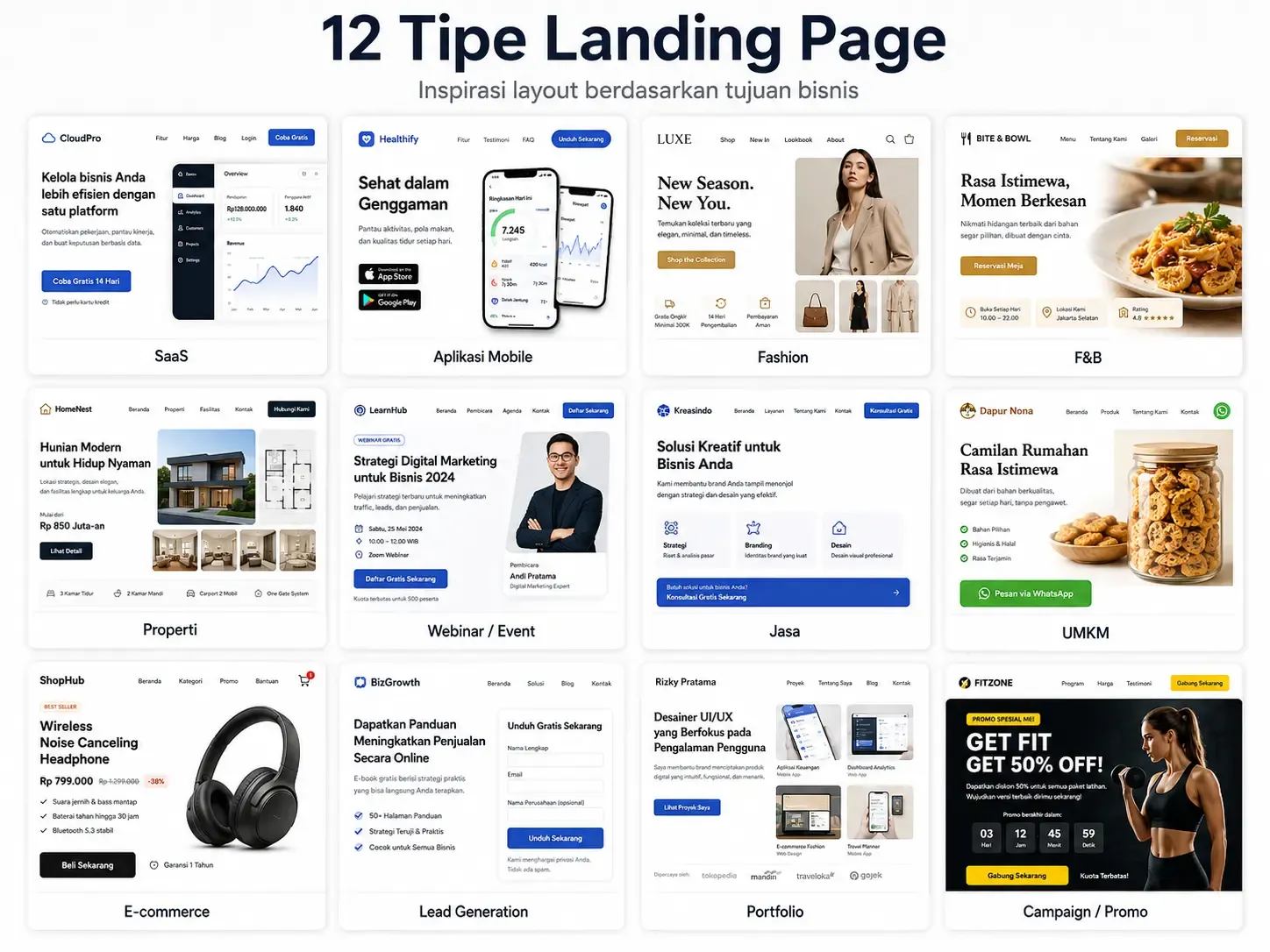
1. SaaS or Digital Product Landing Page
A SaaS landing page usually has one big challenge: explaining a relatively complex product without making users read too much.
That's why an effective SaaS landing page example generally has this structure:
- benefit-oriented headline;
- short subheadline;
- product screenshot or video;
- a CTA like "Try for Free";
- logos of companies using the product;
- key features;
- use cases;
- testimonials;
- pricing or a closing CTA.
Instead of a headline like:
"Cloud-Based Project Management Platform"
a stronger approach usually looks like:
"Manage All Your Team's Projects in One Workspace."
The difference is simple: the first explains the product, while the second directly explains the outcome the user gets.
This matters quite a lot for SaaS. Unbounce's benchmark shows the median conversion rate for SaaS landing pages is around 3.8%, lower than the 6.6% cross-industry median. The same study also found that SaaS copy using simple language tends to produce a better conversion rate than copy that's overly complex.
Design inspiration
Use:
- the product interface as the hero visual;
- a short animation to show the workflow;
- a short headline;
- testimonials from actual users;
- a free CTA with low commitment.
Best suited for
- SaaS applications;
- HR software;
- CRM;
- productivity tools;
- AI platforms;
- B2B software.
2. Mobile App Landing Page
An app landing page has a different job: convincing visitors the app is worth downloading.
That's why the hero section usually shows straight away:
Headline + app mockup + App Store/Google Play CTA.
Example structure:
Headline
All your financial needs in one app.
Subheadline
Manage transactions, track expenses, and monitor your finances directly from your smartphone.
CTA
Download on the App Store | Google Play
After that, visitors can be directed to:
- key benefits;
- app screenshots;
- how the app works;
- user ratings;
- testimonials;
- FAQ;
- a second download CTA.
For this type of landing page, a smartphone mockup is often more effective than an illustrative photo because visitors can immediately picture the experience of using the product.
3. Fashion and Retail Landing Page Examples
Fashion relies more heavily on visuals.
This type of landing page usually doesn't need a long explanation at the top of the page. The product needs to be the center of attention.
A commonly used structure:
Hero photography → campaign headline → promo/value proposition → CTA → featured collection → social proof → CTA.
For example:
The Everyday Collection
Essential pieces designed for everyday comfort.
Shop Collection
Use product photos with consistent lighting and don't fill the hero section with too much information.
Key elements
- high-resolution photography;
- clear price or promo;
- product benefit;
- customer review;
- urgency, if relevant;
- a "Buy Now" or "View Collection" CTA.
If your business sells products directly, this structure can be expanded into a more complete commerce website. Our guide on how to build an online store website can be a relevant next step.
4. F&B Landing Page Example
Imagine you're looking for a place to eat at seven in the evening.
You open a page and immediately see:
mouth-watering food photos, the restaurant's location, operating hours, and a Reserve button.
You're far more likely to take action than if the page opened with five paragraphs of company history.
That's why F&B landing pages usually rely on visuals first.
An effective structure
- photo of the signature menu;
- short headline;
- reservation/order CTA;
- best sellers;
- photo of the restaurant's atmosphere;
- customer reviews;
- address and opening hours;
- Google Maps;
- WhatsApp/reservation button.
For local businesses, information such as city, service area, address, opening hours, contact number, and location map is also important because it helps local users get information without having to search another page.
5. Real Estate Landing Page Example
Real estate landing pages usually involve a high transaction value. Visitors need more information before they're willing to contact sales.
That's why the page is usually longer.
Real estate landing page structure
Property hero → starting price → key benefit → gallery → unit type → facilities → location → developer credibility → consultation form.
The headline can be made concrete, like:
Modern Living, 10 Minutes from Central Bandung
compared to:
A Dream Home for Today's Family
The first headline gives information visitors can evaluate right away.
Other key elements:
- floor plan;
- building area;
- unit type;
- facilities;
- transport access;
- nearby places;
- developer track record;
- construction progress;
- payment simulation;
- a "Schedule a Visit" CTA.
For real estate campaigns targeting a specific area, using geographic keywords like real estate landing page Bandung, housing South Jakarta, or apartment near MRT Jakarta can also strengthen local search relevance.
6. Webinar or Event Landing Page
This is one of the simplest landing page examples to learn from.
It has only one goal:
getting sign-ups.
That's why almost all the content answers these questions:
- what's the event?
- when is it happening?
- who's speaking?
- what will attendees learn?
- who should attend?
- is it free or paid?
- how do I register?
Example structure:
Hero
Free Webinar: How to Improve Website Conversion
September 23, 2026 • 7:00 PM • Online
[Register Free]
Then
- the problem being addressed;
- three things attendees will learn;
- speaker profile;
- agenda;
- testimonials from previous events;
- FAQ;
- a form.
A common mistake is offering too many different CTAs, like:
"Register," "Follow on Instagram," "Read the Blog," "See Other Events," and "Contact Us."
If the main goal is registration, direct most of the page toward that one action.
7. Professional Services Landing Page
This example is well suited for:
- web development;
- consultants;
- agencies;
- digital marketing;
- architects;
- software houses;
- design services.
Unlike a physical product, prospective customers can't see the result of the service directly yet.
That's why trust matters a lot.
A structure you can use:
Problem → solution → services → portfolio → work process → testimonials → FAQ → consultation.
For example, for a website development service:
A Professional Website Built to Support Your Business Growth
Then explain:
- what kind of website is built;
- who the target clients are;
- the work process;
- technology;
- portfolio;
- estimated timeline;
- support;
- a consultation CTA.
If a company doesn't have an internal team to handle it, using a professional website development service can be an alternative to building everything from scratch.
For corporate needs, a landing page approach can also be combined with a company profile website structure so company information and the conversion funnel stay balanced.
8. SME Landing Page
An SME landing page doesn't have to be complicated.
In fact, simple landing page examples are often better suited for small businesses, since users usually only need a few pieces of information:
- what the business sells;
- the price or price range;
- where it's located;
- whether the business can be trusted;
- how to place an order.
For example, a laundry service landing page:
Pickup & Delivery Laundry in Bandung, Starting from Rp7,000/kg
[Order via WhatsApp]
Then show:
Services → price → how to order → testimonials → service area → WhatsApp.
Simple, but it answers user intent quickly.
Business owners who want a website with a similar structure can learn the basics through our guide on how to build a business website or consider a website development service for SMEs.
9. Single-Product E-commerce Landing Page
Unlike a category page that lists dozens of products, a product landing page focuses on selling one main product.
Its structure can follow this pattern:
Problem
What problem does the customer have?
Product
How does the product solve it?
Benefit
What change do they feel?
Proof
Why can that claim be trusted?
Offer
What does the buyer get?
CTA
What's the next action?
For example, a skincare product shouldn't just say:
Contains 5% Niacinamide.
The copy can be translated into a benefit:
Helps keep skin looking brighter and evens out skin tone.
Only after that should you explain the ingredients and supporting evidence.
This way, the page serves two types of visitors: those who want to quickly understand the benefit, and those who want to check the product details.
10. Lead Generation Landing Page
A lead generation landing page is used when the main conversion isn't a direct transaction, but getting prospective customer information.
For example:
- requesting a quotation;
- consultation;
- downloading an e-book;
- a free audit;
- property inquiry;
- insurance quotation;
- demo request.
A landing page like this relies heavily on the form.
The basic principle:
don't ask for more data than you really need.
If the follow-up only needs:
- name;
- WhatsApp number;
- needs;
then asking for a full address, date of birth, job title, company, and 10 additional fields can add friction with no clear benefit.
Also give context near the form.
Example:
Consult us about your website needs
Tell us about your business needs. Our team will contact you to discuss the right approach.
Name
WhatsApp
Website Needs
[Schedule a Consultation]
11. Personal Brand or Portfolio Landing Page
A personal brand landing page often focuses too much on one thing:
"Who I am."
When in fact prospective clients are usually more interested in:
"What can you do for me?"
That's why, instead of opening with:
Hi, I'm Andi. A UI/UX Designer with five years of experience.
you can make it more outcome-oriented:
I Help SaaS Companies Turn Complex Products into Easy-to-Use Experiences.
Then:
- selected projects;
- impact/result;
- expertise;
- clients;
- testimonials;
- a short profile;
- CTA.
The portfolio still shows who you are, but through the lens of the prospective client's needs.
12. Campaign or Seasonal Promo Landing Page
The last type is a promotional landing page.
For example:
- Ramadan Sale;
- Independence Day (August 17);
- Harbolnas (National Online Shopping Day);
- product launch;
- anniversary;
- Christmas Sale;
- brand collaboration campaign.
Campaign landing pages are usually made more visual than evergreen pages.
But the design should still keep this hierarchy:
Campaign → benefit → period → product/promo → mechanics → terms → CTA.
For example:
Weekend Flash Sale — Up to 40% Off
Only August 22–23.
[See Promo]
Urgency is effective when it's genuinely real. Avoid fake countdowns or a "last day only" promo that keeps reappearing every day, as it can erode trust.
Landing Page Structure Comparison by Industry
Landing Page Type | Key Elements | Ideal CTA |
|---|---|---|
SaaS | Product demo, benefit, social proof | Try for Free |
Mobile App | App preview, features, rating | Download |
Fashion | Product photography, collection | Buy Now |
F&B | Food photography, menu, location | Reserve/Order |
Real Estate | Gallery, unit types, location | Schedule a Visit |
Webinar | Speaker, agenda, date | Register Free |
Professional Services | Portfolio, process, testimonials | Get a Consultation |
Small Business | Product/service, price, location | |
E-commerce | Benefit, proof, offer | Buy Now |
Lead Generation | Value proposition, form | Request a Quote |
Portfolio | Case study, expertise | Contact Me |
Campaign | Promo, period, mechanics | Claim the Promo |
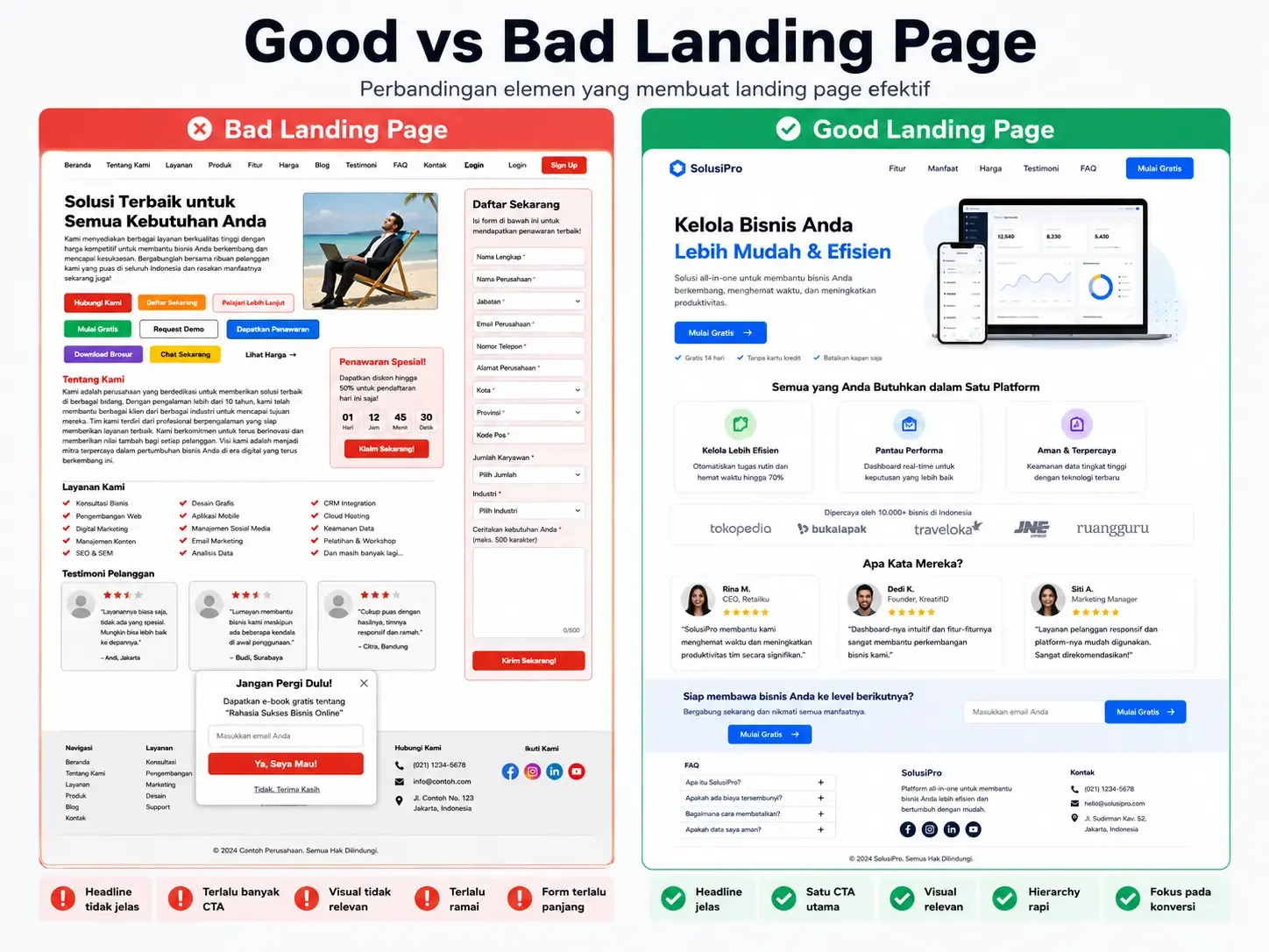
7 Elements Always Found in Good Landing Page Examples
After seeing various landing page website examples, you'll notice a recurring pattern.
1. A Headline That Immediately Explains the Value
Visitors should be able to understand the core offer without reading the entire page.
Use a simple formula:
Outcome + target audience + differentiation
Example:
Manage Payroll for 500 Employees Without Spreadsheets.
which is more concrete than:
Transforming Your HR Experience.
2. A Subheadline That Complements the Headline
The headline grabs attention.
The subheadline provides context.
Example:
Headline:
A Professional Website for a Business Ready to Grow.
Subheadline:
From a company profile to a custom platform, designed around your business needs.
3. Visuals That Explain the Product
A visual isn't just decoration.
For SaaS, use the product UI.
For fashion, use the product.
For real estate, use the building.
For food, use photos of the food.
For services, use a portfolio or work results.
The principle is simple:
The best visual is one that reduces how much the user has to guess about what's being offered.
4. A Specific CTA
Compare:
Submit
with:
Get a Cost Estimate
or:
Click Here
with:
Try Free for 14 Days
A good CTA gives a sense of what will happen after the button is clicked.
5. Social Proof
Visitors don't just ask:
"What's the product?"
They also ask:
"Can I trust this?"
Social proof can take the form of:
- testimonials;
- reviews;
- ratings;
- number of users;
- client logos;
- certifications;
- awards;
- case studies.
Use evidence that can genuinely be verified rather than impressive numbers with no source.
6. Mobile-First Design
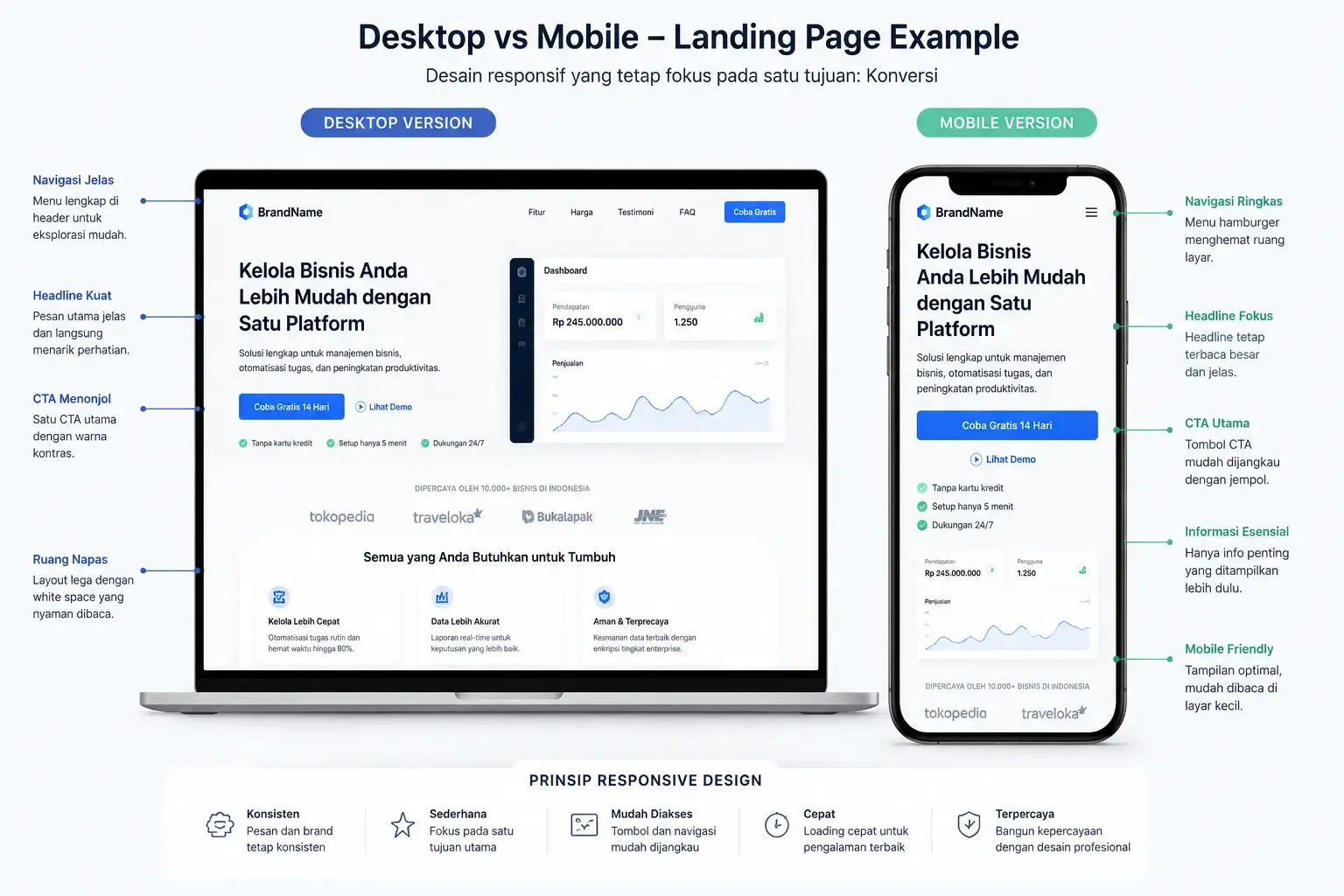
Mobile-first can no longer be treated as an afterthought.
Unbounce's dataset found 83% of landing page visits come from mobile, while overall desktop conversion is still around 8% higher. One interpretation: mobile traffic opportunity is huge, but a poor experience can hold back conversion.
Make sure:
- the font is easy to read;
- buttons are big enough;
- the form isn't too long;
- images are compressed;
- the CTA is clearly visible;
- no horizontal scrolling appears.
Google also recommends a good page experience, including a comfortable mobile display. For Core Web Vitals, Google's recommended "good" targets include LCP ≤2.5 seconds and INP <200 ms.
7. One Clear Conversion Goal
A classic landing page mistake is trying to do everything at once.
"Buy the product."
"Download the app."
"Follow on Instagram."
"Read the blog."
"Subscribe to the newsletter."
"Learn about the company."
In the end, nothing stands out.
Decide on one primary conversion.
The same CTA can be repeated several times throughout the page so users can act once they feel confident.
Anatomy of a Simple Landing Page You Can Copy
If you want to start with a minimal structure, use this template:
Hero
Headline:
Explain the main benefit.
Subheadline:
Explain the product and target user in one or two sentences.
CTA:
Give one action.
Visual:
Show the product or the end result.
Problem
Explain the problem the target audience faces.
Solution
Show how your product solves it.
Benefit
Choose three to five key benefits.
Social Proof
Add testimonials, reviews, client logos, or real results.
How It Works
Give three simple steps.
FAQ
Answer objections before conversion.
Final CTA
Repeat the value proposition and direct visitors to take action.
That structure is already enough to create a simple landing page example that's effective without needing dozens of sections.
If you want to build that structure directly with code, our guide on how to build a website with HTML can help you understand the technical foundation.
Another alternative is using a CMS. For a more flexible approach without building everything from scratch, you can learn how to build a website with WordPress.
Example Landing Page Wireframe

Visually, the page structure can be pictured like this:
------------------------------------------------
LOGO

MAIN HEADLINE
Short subheadline

[ MAIN CTA ]

        HERO IMAGE / PRODUCT UI
------------------------------------------------
TRUSTED BY
[Logo] [Logo] [Logo] [Logo]
------------------------------------------------
PROBLEM USER FACES
------------------------------------------------
SOLUTION / VALUE PROPOSITION
------------------------------------------------
BENEFIT 1 | BENEFIT 2 | BENEFIT 3
------------------------------------------------
PRODUCT DEMO / PORTFOLIO
------------------------------------------------
HOW IT WORKS
1 -------- 2 -------- 3
------------------------------------------------
TESTIMONIAL / CASE STUDY
------------------------------------------------
FAQ
------------------------------------------------
FINAL CTA

[ TRY FOR FREE / GET A CONSULTATION / BUY ]
------------------------------------------------
Not every page needs all of these elements. What matters is that the order of information follows the user's thought process.
How to Choose the Right Landing Page Inspiration
The biggest mistake when looking for landing page inspiration is picking a reference just because it looks cool.
Before taking inspiration from a website, ask five things:
1. Is the target audience similar?
A landing page for enterprise software won't necessarily suit a local bakery.
2. Is the conversion goal the same?
A "download the app" page is different from a "request a quotation" page.
3. Is the user's awareness level the same?
A cold audience needs more explanation than users who already know the brand.
4. Does the product require a high level of trust?
The higher the price or decision risk, the greater the need for proof, FAQs, case studies, and explanation usually is.
5. Does the design still work well on mobile?
Don't only evaluate desktop screenshots.
Don't Copy a Landing Page Raw
Say you find a landing page design example from a well-known tech brand.
The design has:
- a minimalist hero;
- two sentences of copy;
- one button;
- almost no testimonials.
Then you copy it.
The problem is, that brand may already be known by millions of people, so it doesn't need a long explanation.
Meanwhile, your business's prospective customers might be hearing your brand name for the first time.
As a result, a layout that works for them won't necessarily work for you.
What you should copy is the principle, not the look.
Take:
- hierarchy;
- CTA placement;
- storytelling;
- spacing;
- proof structure;
- information flow.
Then adapt it to your own audience and positioning.
A Pretty Landing Page Doesn't Necessarily Convert
There's a pattern that happens often.
A team spends weeks choosing gradients, illustrations, animations, and hover effects.
The page looks great.
Traffic starts coming in.
But conversion barely moves.
After checking, the problem turns out to be simple:
visitors don't understand what's actually being offered.
That's why a landing page's design should be evaluated based on questions like:
- is the value proposition clear?
- is the CTA visible?
- is the page fast?
- do users trust the offer?
- is the key information easy to find?
- is the form too heavy?
- is the design comfortable to use on mobile?
Not just:
"Does this design look cool?"
How Does a Landing Page Support SEO?
A landing page doesn't always have to rely on paid ads.
A page can also get organic traffic when it has clear search intent.
For example:
website development service Jakarta
is more specific than:
website
That's why landing page SEO usually combines:
- primary keyword;
- long-tail keyword;
- location;
- benefit;
- service;
- proof;
- FAQ;
- internal links;
- related entities.
For example, a web development business serving a specific region can have a dedicated page for website development services Jakarta and website development services Bandung, rather than using one generic page for all local searches.
That approach makes the information more relevant to user intent in each region.
But avoid creating dozens of city pages with identical content that only swap out the location name. Each local page should have information that's genuinely useful for that region's audience.
How to Make a Landing Page More SEO and AI Search Friendly?
Modern SEO doesn't stop at inserting keywords.
Content also needs to be easy for humans, search engines, and AI-based search systems to understand.
Some principles you can apply:
Use direct answers
After a heading phrased as a question, answer the core of the question in the first paragraph.
Create a logical heading structure
Use H2 and H3 based on subtopics, not just to make the text bigger.
Use entities and related terms
For landing page topics, relevant terms include:
- conversion rate;
- call-to-action;
- hero section;
- lead generation;
- CRO;
- responsive design;
- social proof;
- landing page builder;
- A/B testing;
- user experience.
Add experience and concrete examples
Don't just say "use a good CTA."
Show a comparison of CTAs and explain why.
Include trustworthy sources
Statistics or important claims should come from a verifiable source.
Build a topic cluster
A landing page can be linked to related topics such as:
- how to build a website;
- HTML;
- WordPress;
- business website;
- online store;
- web development;
- website services.
Internal linking like this helps users continue their information journey while also clarifying the relationships between topics on the website.
Checklist for an Appealing Landing Page
Before publishing a landing page, check:
- the headline explains the main benefit;
- the subheadline provides context;
- one main CTA is clearly visible;
- the hero visual is relevant;
- social proof is available;
- benefits stand out more than jargon;
- navigation doesn't distract attention;
- the form only asks for essential data;
- the page is comfortable on mobile;
- images are optimized;
- the page has a closing CTA;
- contact information is easy to find;
- conversion tracking is set up;
- the landing page is tested on several screen sizes.
If most of these points are met, your landing page's foundation is already much better than just copying a template.
Frequently Asked Questions About Landing Page Examples
What is a landing page?
A landing page is a web page built with one main conversion goal, such as getting leads, sales, sign-ups, app downloads, reservations, or consultation requests.
What's a good landing page example?
A good landing page example has a clear headline, one main CTA, relevant visuals, social proof, and an information structure that guides users toward conversion. The design doesn't have to be complex.
What does a landing page contain?
A landing page usually has a headline, subheadline, hero visual, benefits, social proof, product or service explanation, CTA, and FAQ. A landing page for a complex product can add a demo, case study, pricing, or comparison.
What's the difference between a landing page and a website?
A website usually consists of many pages and serves several purposes, while a landing page is generally a single page focused on one specific campaign or conversion goal.
Does a landing page need to have a lot of content?
No.
A landing page's length should follow the product's complexity and the amount of information users need to make a decision.
A simple product can use a short landing page. High-value products like enterprise SaaS, B2B services, and real estate usually need more information and proof.
What's a simple landing page example for a small business?
A simple SME landing page can consist of:
headline → product photo → benefit → price → testimonial → location → WhatsApp CTA.
That structure is already enough for many local businesses like laundry, salons, food stalls, workshops, or household services.
Where can I find landing page inspiration?
You can use design galleries like Dribbble and Behance to find visual references, then study company websites in the same industry to understand the landing page structures actually being used.
Don't just look at screenshots. Also pay attention to the CTA flow, mobile version, page speed, proof, and form experience.
Is it okay to copy a competitor's landing page?
You can study general patterns like section structure, information hierarchy, or CTA positioning.
But avoid copying the design, illustrations, photography, brand identity, and copy identically.
Use the reference to understand the pattern, then build visuals and messaging that fit your own brand.
Does a landing page need to be mobile-friendly?
Yes.
Unbounce's benchmark data shows the majority of landing page visits in their dataset come from mobile devices. That's why mobile design should be a core part of the design process, not just a shrunken version of the desktop layout.
What's a good landing page conversion rate?
There's no universal number, since conversion rate is heavily influenced by industry, traffic source, offer type, and how conversion is defined.
As a general benchmark, an Unbounce report based on more than 41,000 landing pages found a cross-industry median of around 6.6%. SaaS, for example, has a median of around 3.8%, so benchmarks should be compared against a relevant industry.
Conclusion
Looking for appealing landing page examples is the right step before moving on to wireframing or visual design.
But don't stop at the question:
"Which design is the coolest?"
A more important question is:
"Why does this page make visitors understand the offer and take action?"
From all the landing page examples above, the most consistent pattern is:
- the value proposition can be understood quickly;
- the headline is benefit-oriented;
- the visuals support the offer;
- there's one main CTA;
- social proof builds trust;
- information is organized around user needs;
- the mobile experience remains a priority.
Start with a simple structure, measure the results, then improve based on user behavior.
Because the best landing page isn't the one with the most animations or the most complex design.
The best landing page is the one that helps visitors understand the value you're offering—then makes it easy for them to take the next step.



Comments
Got a question or feedback? Leave a comment!